People use phones, tablets, laptops, and desktops to browse the web every day. Each screen has a different size, shape, and resolution. If your website doesn’t adjust to those differences, it can look awkward—or even break completely. That’s why responsive design matters.
For developers and designers, making a site work well on every device used to take a lot of trial and error. Now, responsive design tools can handle much of the work. They save time, improve consistency, and help websites feel polished no matter where they’re viewed.
📱 Quick Summary
- Responsive design tools help websites adapt to different screen sizes.
- Frameworks like Tailwind CSS, Bootstrap, and Foundation simplify layout and spacing.
- Browser dev tools and design platforms like Figma make testing and previewing easier.
- Using breakpoints and flexible grids ensures layouts feel natural across devices.
- Tools also help speed up development and reduce bugs in the final design.
Why screen flexibility makes a big difference
Imagine visiting a site on your phone, but the text is tiny, and you have to pinch-zoom just to read it. Or maybe buttons are too small to tap. That kind of experience frustrates users and pushes them away.
Responsive design solves this by making sure everything—from fonts to images to buttons—adjusts to the screen size. Whether someone is using a small phone or a 4K monitor, the site still looks and works great.
Using the right tools makes this process smoother and less manual. Instead of guessing or writing endless custom CSS, these tools give you built-in solutions.
Frameworks that do the heavy lifting
CSS frameworks make it easier to build layouts that adapt. They often come with pre-designed classes and grid systems that respond to screen width.
Here are some popular ones:
Tailwind CSS – Utility-first and super flexible. You write your layout using class names like md:grid-cols-2 or lg:p-10, which change based on screen size.
Bootstrap – One of the oldest and most widely used. It comes with a responsive grid and components that work across devices out of the box.
Foundation – A bit more advanced, but solid for creating responsive interfaces with accessibility in mind.
Using a framework doesn’t mean your site will look generic. They’re just starting points. You can still add custom styles to make everything feel personal.
Breakpoints and how they help
Breakpoints are screen widths where your layout changes. For example, you might want a two-column layout on a laptop, but just one column on a phone.
Browser tools make testing easier
Chrome, Firefox, and Edge all have built-in tools for checking how your site looks on different screen sizes. You can:
Toggle between mobile and desktop views
Simulate touch events
Throttle network speed to test load times on slower connections
These tools are especially helpful before pushing your design live. You can spot layout issues early and fix them quickly.
Bonus tip: In Chrome DevTools, hit Ctrl+Shift+M (or Cmd+Shift+M on Mac) to toggle the mobile view instantly.
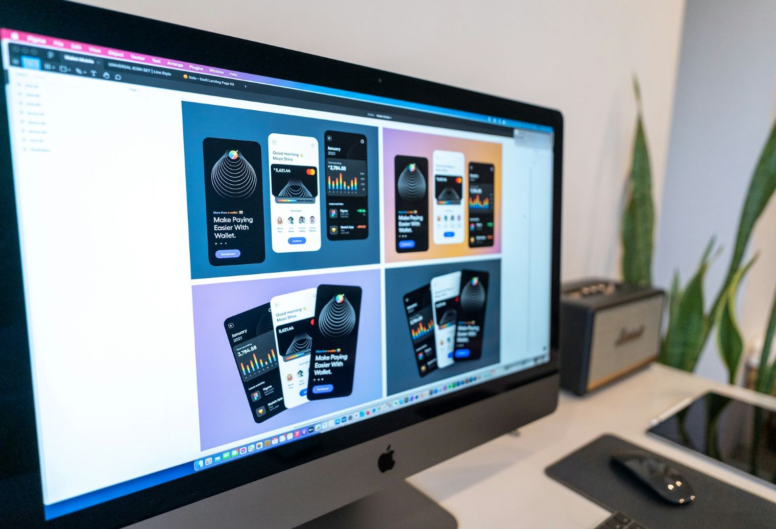
Visual design tools that support responsive work
If you’re designing interfaces in tools like Figma, Adobe XD, or Sketch, you can set up constraints that make your design adapt to screen changes.
For example, in Figma:
Set an image to “scale” to keep it responsive
Attach buttons to the left, right, or center so they stay aligned
Preview how your layout reacts as the screen resizes
This helps you plan responsive behavior before writing a single line of code. Designers and developers can collaborate more smoothly, too.
Real example: A personal blog layout
Let’s say you’re building a blog. On desktop, you want a sidebar for categories and a main area for posts. But on mobile, you want the sidebar to disappear and the posts to stack vertically.
Using Tailwind CSS, you could write:
htmlCopyEdit<div class="flex flex-col lg:flex-row">
  <aside class="lg:w-1/4">Sidebar</aside>
  <main class="lg:w-3/4">Blog posts</main>
</div>
This setup means:
- On small screens, the layout stacks vertically.
- On large screens, the layout becomes a side-by-side row.
That’s responsive behavior in just a few lines of code.
Keep media flexible too
Images and videos need to scale just like layouts. You don’t want an image that’s too wide or a video player that spills off the edge of the screen.
Some helpful practices:
Use max-width: 100% in CSS so images shrink on smaller screens
Set videos to width: 100% with a responsive container
Use srcset to serve different image sizes based on the device
This keeps your media looking good without slowing things down.
Simple tools that help the process
You don’t always need a full design system or complex setup to build responsive websites. Sometimes, a few lightweight tools can make a big difference—especially during testing and layout tweaking.
Here are a few options worth checking out:
Responsively App – This free desktop app lets you see how your site looks on multiple device screens at the same time. Instead of opening several browser windows, you get a single view showing phones, tablets, and desktops side-by-side. It updates in real-time, so when you change your code, you can instantly check how it behaves across screen sizes.
Blisk Browser – Designed with developers in mind, Blisk has built-in device emulators. You can view your website as if you were using different phones or tablets, and scroll them all together. It also tracks performance, errors, and screen resolutions, which is helpful for catching bugs early.
Media Query Generator – This is an online tool that helps you write the CSS code needed to create breakpoints. Just enter the screen sizes you want to target, and it generates the proper @media rules. It’s a great option if you’re still getting used to writing custom CSS or want to speed things up.
Each tool has its strengths. You don’t need to use them all. Try one or two that fit how you like to work. If you prefer visual testing, go with Responsively App. If you like a browser focused on development features, Blisk might be your go-to. And if you’re building from scratch with custom CSS, the media query generator can save time and reduce errors.
These tools won’t magically fix layout problems, but they make the testing process smoother and help you spot layout issues before your users do.
Make it work for your users
At the end of the day, responsive design is about making sure your site works well for everyone. Whether someone’s on an old tablet or the newest iPhone, they should get a smooth, frustration-free experience.
Tools can speed up that process and help you stay consistent, but the goal is simple: build something that feels good to use on any screen.
No Responses