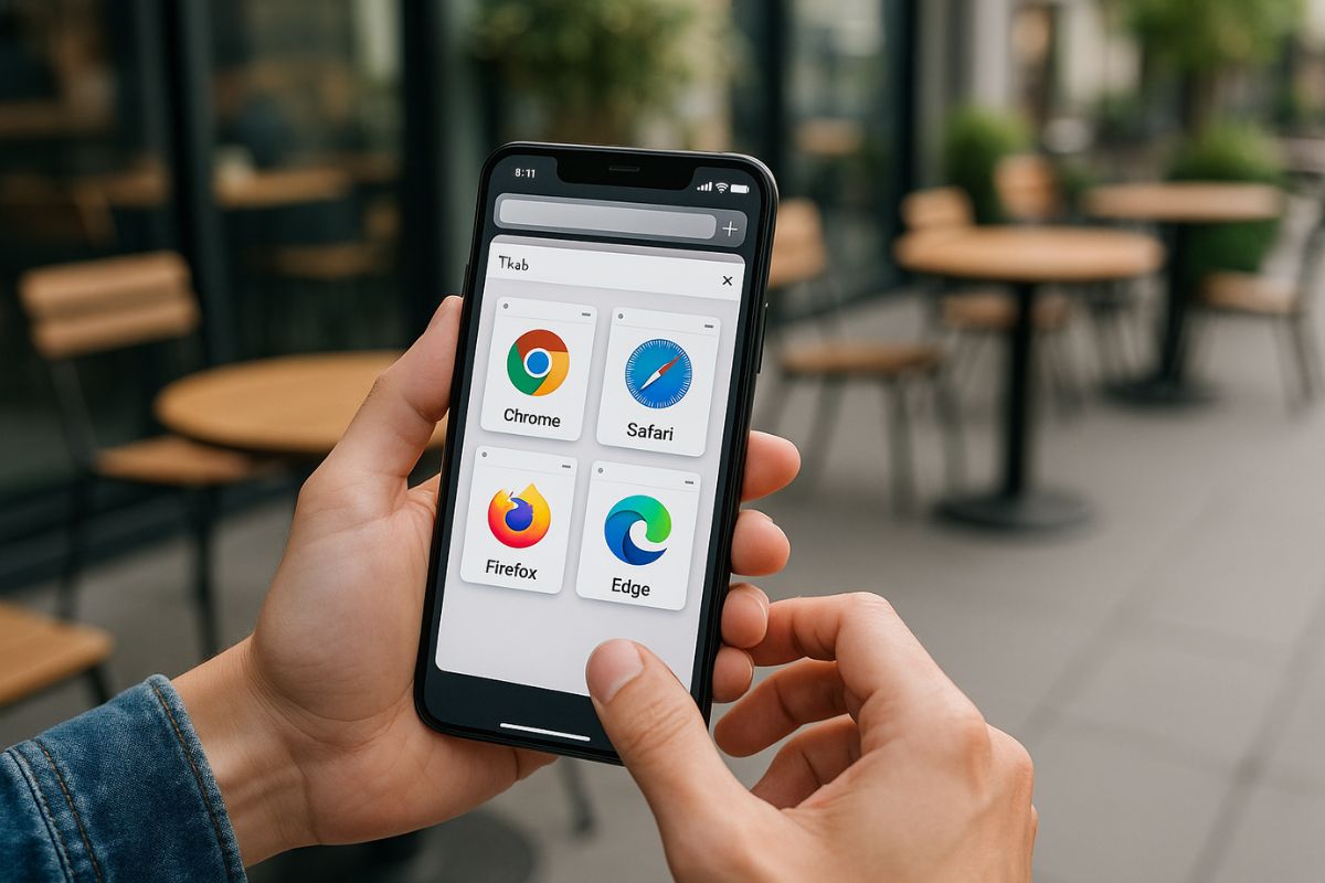
Choosing a mobile browser used to be simple. Today, it’s anything but. With so many options out there—from Chrome and Safari to Brave, Firefox, and Samsung Internet—each browser offers something different. Whether it’s speed, privacy, syncing, or design, users are picking sides based on what matters most to them.
For developers and product teams, keeping track of mobile browser trends helps guide testing and design decisions. A site that runs great on one browser might have subtle quirks on another. And if you know which browsers dominate in your audience segment, you can fine-tune performance where it counts.
What This Post Covers
Here’s a quick breakdown of what we’ll cover:
- Which mobile browsers are leading the market right now
- What users expect from their mobile browsing experience
- How browser choices affect web performance and compatibility
- Why these trends matter for developers building responsive apps
This is a guide for anyone who builds for the web and wants to stay ahead of the curve—without sifting through endless reports.
Chrome Still Holds the Lead
Across Android devices, Google Chrome is still the most-used mobile browser. That’s partly because it comes pre-installed on most Android phones, but it’s also because people like how it syncs across devices, connects with Google accounts, and generally feels fast and reliable.
Chrome also plays well with modern web standards, so it’s a safe choice for developers to test first. It supports progressive web apps, background sync, and most CSS and JavaScript features you’d expect in a modern engine.
That said, Chrome isn’t perfect. It’s been called out for data collection practices, and not everyone loves having Google baked into everything. That’s where alternatives start to gain ground.
Safari Rules on iPhones—For Now
On iOS, Safari is still the default browser. Apple doesn’t let other engines run natively on iPhones, which means all mobile browsers on iOS technically use Safari’s WebKit engine, even if they look different.
Safari on iOS is clean, fast, and well integrated with the system. It supports Apple Pay, Face ID for autofill, and the newer web extensions. But it also has a reputation for being behind the curve in adopting some features, especially those that help with offline support or advanced web apps.
Some iPhone users switch to browsers like Chrome or Firefox for the interface and syncing, but under the hood, it’s still WebKit.
Brave and Firefox: Privacy on the Rise
Privacy concerns are shifting user behavior, and that’s where browsers like Brave and Firefox are carving out space. Brave blocks ads and trackers by default, which appeals to users tired of seeing the same ads follow them across the web.
Firefox Focus is another option, offering a minimal, private-by-design browsing experience. These tools appeal most to users who are already privacy-conscious, but they also attract people looking for a faster, cleaner web.
For developers, it’s worth knowing how these browsers handle cookies, local storage, and scripts. Sometimes, a feature that works well in Chrome might break silently in Brave because of a blocked tracker or script.
Samsung Internet: Quiet but Reliable
Samsung Internet doesn’t get much press, but it has a loyal following. Pre-installed on Samsung devices, it’s surprisingly robust and often performs well in speed tests. It supports features like dark mode, smart anti-tracking, and extensions like ad blockers.
Samsung Internet also uses Chromium under the hood, so most sites built for Chrome perform the same here. But its UI and feature set are designed to appeal to Samsung users specifically, which means certain habits or interface expectations may differ slightly from other browsers.
Developers shouldn’t ignore this browser, especially if their audience includes a large number of Samsung users.
Opera and Niche Options Still Have a Role
Opera Mini and Opera Touch serve users who want lightweight performance or have limited data plans. These browsers use compression to speed up loading and save bandwidth, which makes them popular in regions where mobile data is expensive or slow.
There are also browsers designed for specific communities or functions—like UC Browser, which has a big user base in Asia. These don’t always follow standard web practices, and some are known for aggressive caching or content rewriting.
While they don’t dominate globally, niche browsers still deserve attention if your site serves users in specific regions or demographics.
What the Numbers Say
Usage trends vary by region, but global data shows Chrome leading by a wide margin, followed by Safari. The rest—Samsung Internet, Firefox, Brave, Opera—take up smaller slices, but they’re not insignificant. In some countries, the default browser on a popular brand of phone can be the second or third most-used choice.
It’s also important to factor in user intent. Someone who chooses Brave likely has different priorities than someone who sticks with Chrome. That can influence not just how they browse, but also what they expect from your site in terms of speed, privacy, or responsiveness.
How Browser Choice Affects Web Development
Different browsers interpret code slightly differently. CSS layouts might look fine on one but misalign on another. JavaScript timing could shift depending on how the engine handles execution or background tasks.
This matters most when building features that rely on performance or system-level interaction—like camera access, geolocation, or file uploads. Testing on multiple browsers helps catch edge cases that automated tools might miss.
Responsive design and accessibility also show their strength here. A site that adapts well to different screen sizes, input types, and network speeds is more likely to work across all browsers.
Supporting the Right Browsers for Your Audience
It’s not realistic to test every browser under the sun, but it helps to focus on the ones your users care about. Web analytics can tell you which browsers are visiting your site. Start there. Make sure your main paths work as expected on those platforms.
Don’t forget about performance, either. A fast experience in Chrome is great, but if it’s sluggish in Samsung Internet, a big chunk of users may not get the full experience.
Also consider feature detection instead of browser detection. That way, you can build experiences that adapt to the tools available instead of assuming what each browser can do.
Trends Are Shifting—but User Needs Stay the Same
Browser trends change with time, but users still want the same things: fast load times, clear content, smooth interaction, and a sense that their data is safe. Whether they’re on Chrome, Safari, or something less common, your job as a developer is to meet those expectations without overcomplicating the experience.
Keeping an eye on browser trends is one way to stay sharp. It helps you prioritize your testing, adjust your strategy, and make decisions that serve real people better.
No Responses