Images shape how we experience the web. Whether it’s showcasing a product, telling a story through a blog post, or guiding a user through an app, visual content plays a major role. But there’s a trade-off—image files can be large, slowing down websites and affecting user experience. That’s where modern image formats come in. They offer a smart way to improve web delivery without sacrificing quality.
Choosing the right format can speed up page load times, reduce data usage, and even improve SEO. Developers, designers, and content teams all benefit when images work better for users. In this article, we’ll look at the key formats leading this shift and how to work with them effectively.
Why Format Choice Matters in Web Performance
Every image on a site adds weight. When that weight adds up, it can create friction—slow-loading pages, poor mobile performance, and higher bounce rates. Traditional formats like JPEG and PNG have served well for years but aren’t built for today’s web needs.
Modern formats like WebP, AVIF, and JPEG XL compress image files more efficiently. This means smaller file sizes for the same or even better quality. That’s a big deal for anyone working on responsive websites, mobile apps, or content-heavy platforms. Tools like a heic converter can also help developers manage formats from mobile devices that often produce high-resolution HEIC images, ensuring they’re usable across browsers and devices.
Faster sites improve user satisfaction, conversion rates, and even search engine rankings. By optimizing images, you’re also being mindful of users with limited bandwidth or those browsing on mobile data plans.
A Brief Overview of Modern Image Formats
Here’s a look at three formats gaining momentum:
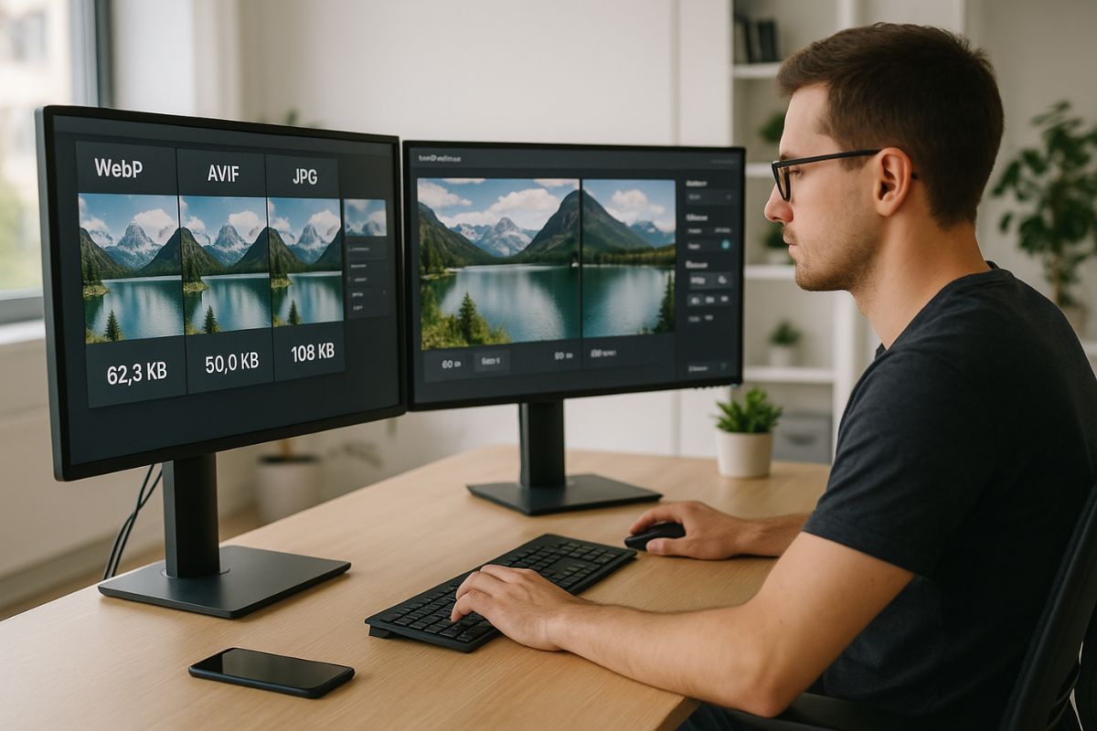
WebP is backed by Google and offers better compression than JPEG and PNG. It supports transparency and animation, making it a versatile choice for both photos and graphics.
AVIF goes even further. It delivers smaller file sizes than WebP at similar or better quality. It’s good for high-resolution photos, but encoding can be slower, and browser support isn’t complete yet.
JPEG XL is a newer format that aims to improve on JPEG while adding modern features like lossless compression, transparency, and animation. It’s designed for long-term use and compatibility.
These formats are not just about saving space. They’re part of building a web that performs well, respects user data, and loads quickly across all kinds of devices.
WebP: Balancing Quality and Compatibility
WebP has become a go-to for many developers. It offers good compression, supports transparency, and is supported by all major browsers. WebP works well for product photos, blog images, banners, and icons.
Conversion tools like Squoosh or command-line utilities like ImageMagick make it easy to generate WebP versions of existing files. Many CMS platforms and build tools now include WebP support out of the box.
When you replace a JPEG or PNG with a WebP version, you often see size reductions of 25–35%, sometimes more. That’s enough to speed up a page and improve user experience without changing anything visually.
AVIF: Efficient Compression for Rich Visuals
AVIF uses advanced compression techniques to deliver very small file sizes while keeping excellent image quality. It’s based on the AV1 video codec and is ideal for media-rich sites, large photos, and high-resolution designs.
The format supports features like HDR (High Dynamic Range), which gives you more color depth and realism. This makes it appealing for photography portfolios, editorial websites, or design agencies.
But there are trade-offs. AVIF files can take longer to encode, which might slow down build processes or content pipelines. Also, browser support is not as broad as WebP, though it’s growing.
To use AVIF wisely, test it across devices and offer fallback options for browsers that don’t support it yet. Combining it with the <picture> HTML tag helps deliver the best format the user’s browser can handle.
JPEG XL: Looking Ahead
JPEG XL is still emerging but shows strong promise. It combines the strengths of JPEG (broad compatibility) with modern features like efficient compression, lossless quality, and support for animations and transparency.
This format is designed for scalability and long-term use. It can be especially helpful in large media libraries, digital archives, and platforms that manage both photos and graphics.
Because support is still rolling out across browsers and devices, JPEG XL is more of a future-focused choice. For now, developers can test it in limited use cases or controlled environments.
How to Serve Modern Images Effectively
Switching formats isn’t just about conversion. You also need a plan for serving the right file to the right browser. Here’s how:
Use the <picture> element to define different versions of an image for different browsers. For example, you might serve AVIF first, then WebP, and fall back to JPEG if needed.
Optimize image sizes for various screen resolutions. Tools like responsive image sets (srcset) help the browser choose the best file size for each device.
Use compression tools that let you control quality settings. Many online tools let you preview results and choose a balance between file size and visual fidelity.
Cache images properly and use CDNs (Content Delivery Networks) to distribute them efficiently. Faster delivery helps users get content quicker and reduces server load.
Automate image handling as part of your build process. Many web frameworks and site generators have plugins or modules that can handle format conversion, resizing, and lazy loading.
Measuring the Impact of Modern Image Formats
To really understand the value of switching formats, track your site’s performance before and after. Use tools like Google PageSpeed Insights, Lighthouse, or WebPageTest to measure load times and image sizes.
You’ll often see improvements in:
- Page load speed
- Time to first contentful paint
- Mobile performance scores
- Bounce rate reduction
These changes contribute to better SEO, higher user retention, and more conversions.
When Not to Use a Modern Format
While newer formats offer many benefits, they’re not always the right fit. For example:
- If your users rely on older browsers, stick with widely supported formats like JPEG and PNG.
- If your CMS doesn’t support WebP or AVIF yet, switching might create workflow issues.
- For vector graphics, SVG remains the best option. It’s resolution-independent and works well for logos, icons, and simple illustrations.
Choose formats based on your audience, infrastructure, and site goals.
Small Adjustments That Make a Big Difference
Even if you’re not ready to overhaul your whole media library, small steps still help. Try converting your homepage images to WebP or AVIF. Test them. Measure the results.
When you redesign a section of your site or launch a new feature, make modern formats part of that process. Over time, these changes build into a faster, more efficient site.
Making the Web Work Better
Modern image formats are more than just a tech upgrade. They’re part of making the web more usable, faster, and inclusive. By compressing images without cutting quality, they make content more accessible, especially on slow connections.
Developers who understand and apply these tools help move the web forward. Whether you’re working on a personal blog, an ecommerce platform, or a government service, better image handling improves the experience for everyone.
Start small, keep learning, and make modern formats part of your toolkit.
No Responses